
A Photographer’s Website
One of my Twelve Guiding Principles of Photography deals with the need of all serious photographers to maintain a website to showcase their art. Facebook is important, but your photos there only have a half-life of about three days. This basically means that in a month or so your photos will be buried deep in your photo stream. According to Scott Kelby, a major purpose of Facebook and Instagram is to get people to visit your website. This is your office, your place of business, your gallery, and the home of your portfolio.
The purpose of this article is to examine ways to painlessly develop your website and to discuss what elements your website should exhibit. My website above is not a good example of a photographer’s page. Mine is actually four sites in one. It is a photographer’s site, a travel site, a personal site, and a school site. This is way too much if I desired to be a professional photographer, but it works for my life and needs.
Style of the Site
- Good Domain Name: Don’t get too cute with your site’s name. A simple, sensible web address is essential. You want it easy for your potential clients to memorize and share.
- White is Clean: There was a time when a dark background was considered optimum for a website, but today the theory is you want your photos on white. This appears to make then to jump out at the viewer.
- Name & Logo: Keep them small and simple. They are there for a purpose, which is to identify you and your work. They should not be in competition with your work, and they should not take up too much real estate on your page.
- Keep Navigation Simple: People do not want to try to spend time trying tofigure out how to explore your site. Again, keep it clear and simple.
- Size Matters: Keep your photos a good size. Realize, however, that if you are using full page photos, the download time may be an issue.
- Portfolios are the Core: If you are a portrait photographer, make sure you have about 20 portraits of different subjects. You want the visitor to know what to expect if they decide to hire you. If you also do wedding, have a wedding portfolio present also. Generally the maximum number of portfolios is four. Realize on my site, I have six, but I am just having fun!
- Contact Me: Have an “About” or “Contact Me” link. Include a photo and some personal information. Make yourself appear to be a real person, not just a business.
- Prices: There is some discussion on this. Generally this is not included. Let the interested person contact you, and then together talk about the price package.
- Quality over Quantity: Basically less is more. Exhibit only your best work photos
Examples of CZPC
Senior Members’ Pages
John’s Site – Applesauce Photography
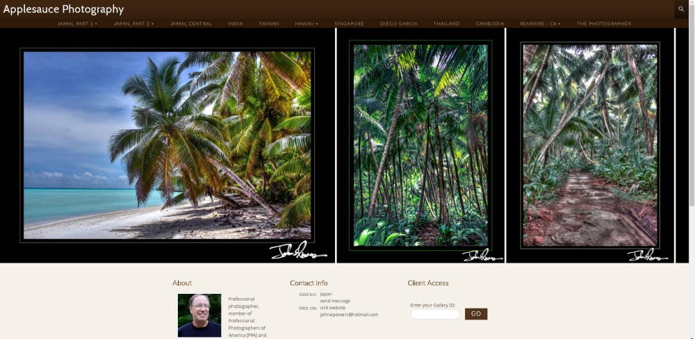
Notice that John’s photo and name are small. The photos are large, and there is some personal information,There is also a clear way to contact him. John’s site could be classified as mainly a Travel Site. It is a beautiful showcase of the world’s most beautiful places.
Barry’s Site on Adobe Portfolio

Adobe Portfolio is a relatively easy way to present a personal web site. Notice that Barry’s page is on white, and the navigation is clear. The photos are also a good size. Portfolio presents an easy way to showcase your work.
Marlene’s Blog
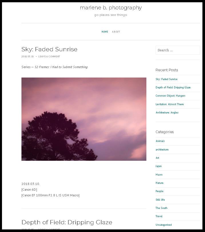
Another way to go is with a blog as Marlene does on her site. This is a series of articles showcasing experiences or projects that serve to give your photography a context in time.
Flickr
My “Practice” Website
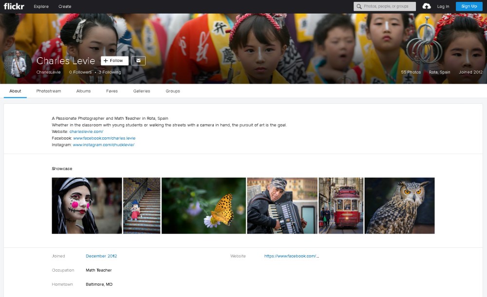
The above is a site I recently created solely for this presentation. Several of the members of my “new” camera club, The Baltimore Camera Club, use Flickr to host their personal sites. A few years ago I had nothing to do one night so I joined Flickr, All I did with the new site was to post three photos, and then I simply forgot all about it. After looking at the photographers’ sites, I returned a couple of weeks ago to examine the possibilities with this platform.
I was immediately amazed at how easy and versatile Flickr was. The user is able to actually create a list of linked pages
Some of the positives are as follows:
- It provides for an attractive Home page.
- A white background
- It allows you to place a cover photo on top as does Facebook.
- It provides an easy way to display your personal information.
- It also slows you to select several special photos that will appear on this home page
- The navigation is clear.
- It provides a clear menu for your “Albums”
Flickr Albums
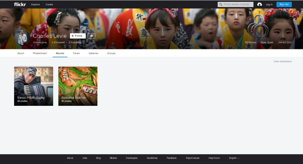
I create two albums for this test site, Animals and Street Photos, It allows you to select a photo cover/link for each album, which is clear and attractive.
An Album
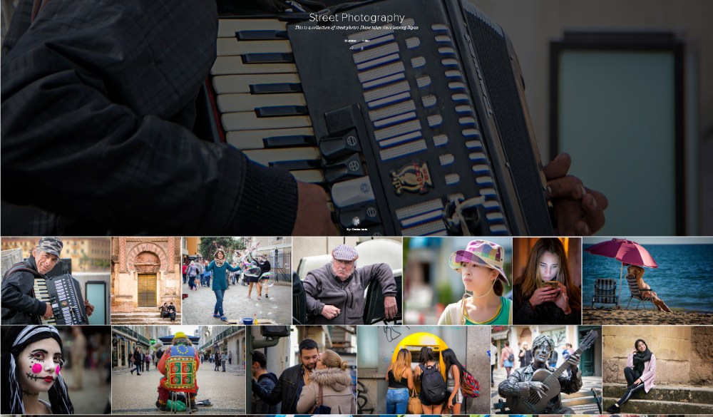
This is a cropped view of my actual Street Photo album. Once you click on a photo, it presents a nice slide show to view all the photos in the album.
Conclusion
If you do not have a Photographer’s Web Site, Flickr may be for you. It is both an attractive site and easy to use. It is a great way to let the world witness your work. It also allows you a fastastic venue to maintain and upkeep your portfolio. Remember, you can only add a new photo if you remove an existing one. This way over time your portfolio grows stronger and more attractive.
If you have time, click on the my Flickr link and see the possibilities for your new personal photographer’s site. This may be what you have been looking for all along…
