Photography: Color or B&W
How is one to decide between processing that newly captured image in Color or in Black and White?
In the world of photography there are several choices that the photographer must make prior to the nuts and bolts of post processing. The first relates to orientation. Should the image be presented in Landscape or Portrait perspective? The second relates to Aspect Ratio. Is the traditional portrait ratio of 4×5 better suited than the wider view of 4×6? Perhaps one should go even wider for a more panoramic ratio. These two issues are not that complex and rather simple decisions for the serious photographer. A sidenote is that I just read that a major photo contest in my state requires that the images be in a landscape presentation with a 4×5 aspect ratio.
The next decision the photographer undertakes is far more artistic in its nature. Should one transform the image to Black and White or leave it in Color? Realize also that in the days of film, this decision had to be made prior to leaving one’s home. Now it can occur at anytime. Notice that I am saying “leave it in Color.” No matter what the outcome, one should never initially shoot in B&W mode. Never allow the camera to choose arbitrarily what colors and to what degree they go black and grey.
The colors of an image basically control the mood and emotion of the subject. Black and White photos, however, tend to create a more timeless image. Also mastering Ansel Adams’ 10 Point Zone System allows the photographer to create real drama within the image. Color can, therefore, more easily convey an atmosphere of joy, while B&W tends to denote a more somber effect.
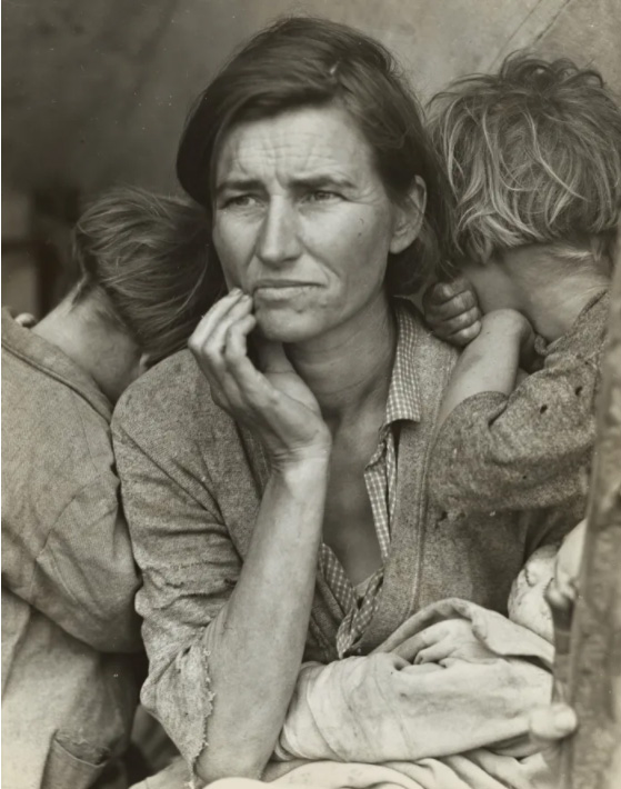
Below are my two all-time favorite photos by the masters – “Afghan Girl” by Steve McCurry and “Migrant Mother” by Dorothea Lange.

Color serves to transcend this young girl from the plight of her present reality to her inner sense of pride and control. This image would have simply been a routine portrait of a poor young girl in B&W.
The second image of Florence Owens Thompson is considered the iconic image of the Great Depression. Color would have made this image “pretty,” which was far from the objective of Lange. “Migrant Mother” served to show the viewer in one image the hardship and desperation of the poverty of the time. These two images are prime examples of the power and influence of the art of photography.
The following are two of my environmental portraits from Japan which I hope further show the impact of Color vs. B&W.
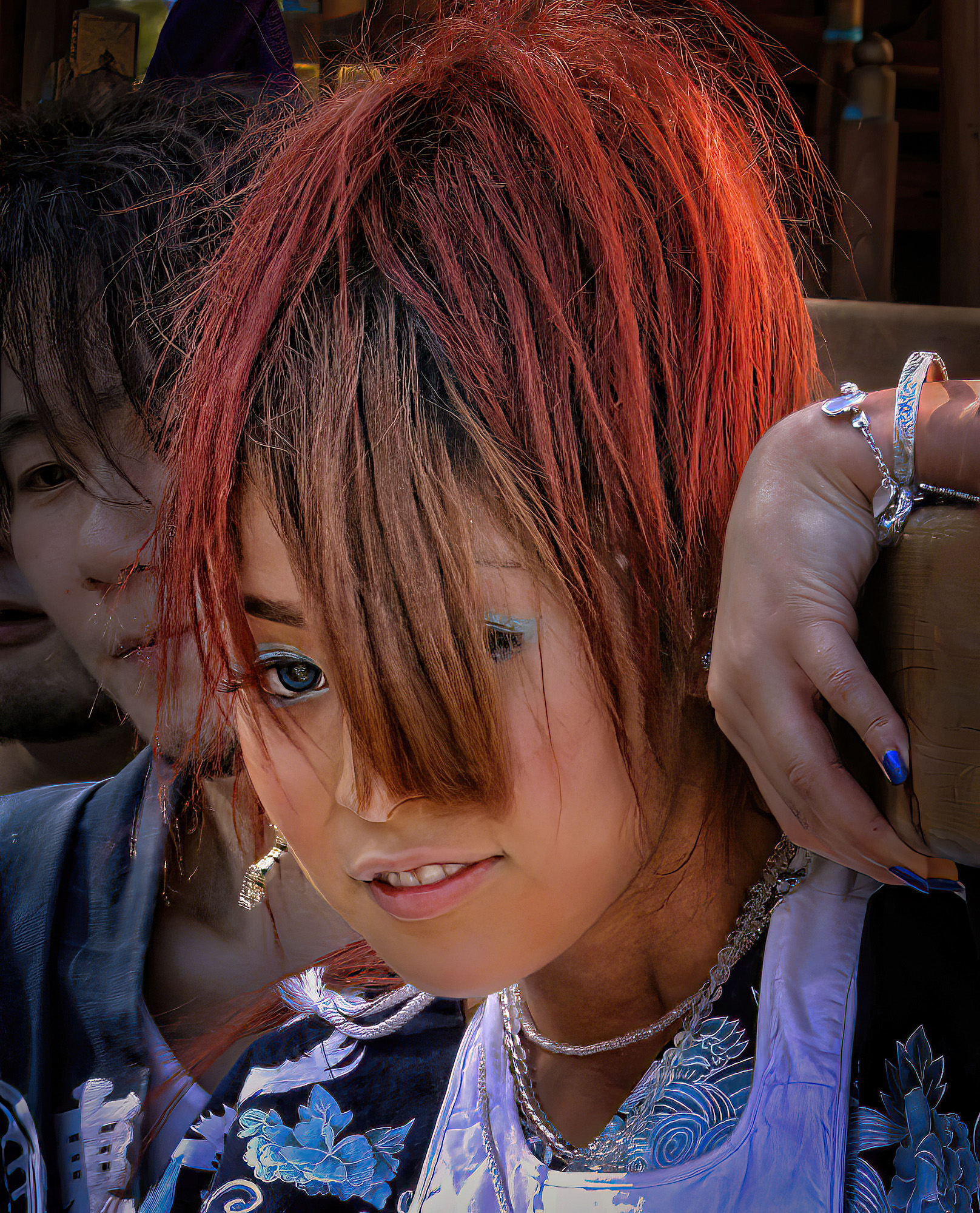
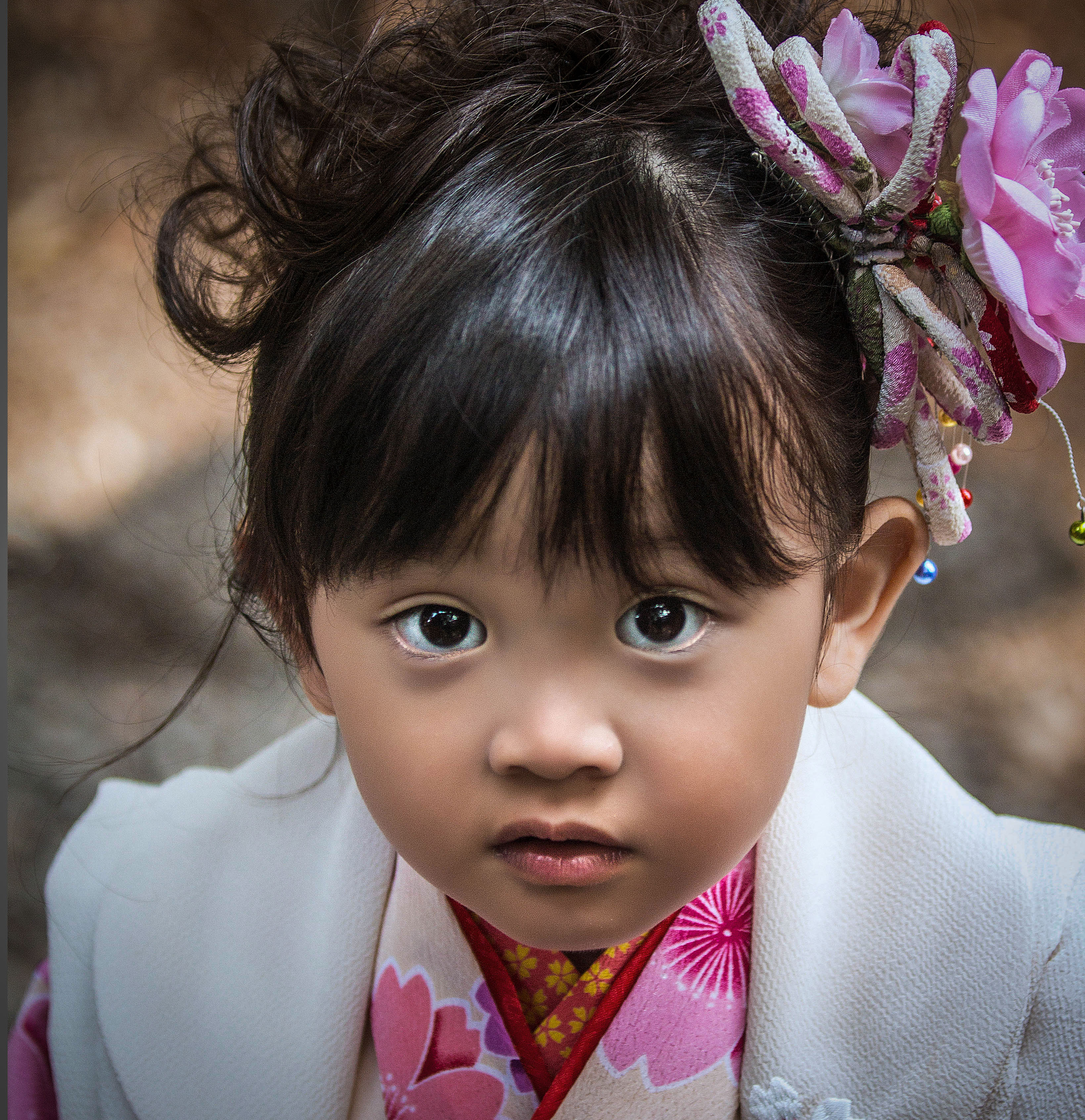
My image on the left, “Festival Girl,” is about the dichotomy of modern dress with the ancient traditions of Matsuri in Japan. The use of color is imperative in showing the girl as a cultural contradiction with her modern life.
The image on the right, “Beauty Hidden,” is all about the young woman’s eye. The shades of grey throughout the image serve to direct one to the darkness of her eye. This all adds to the mystery of her beauty.
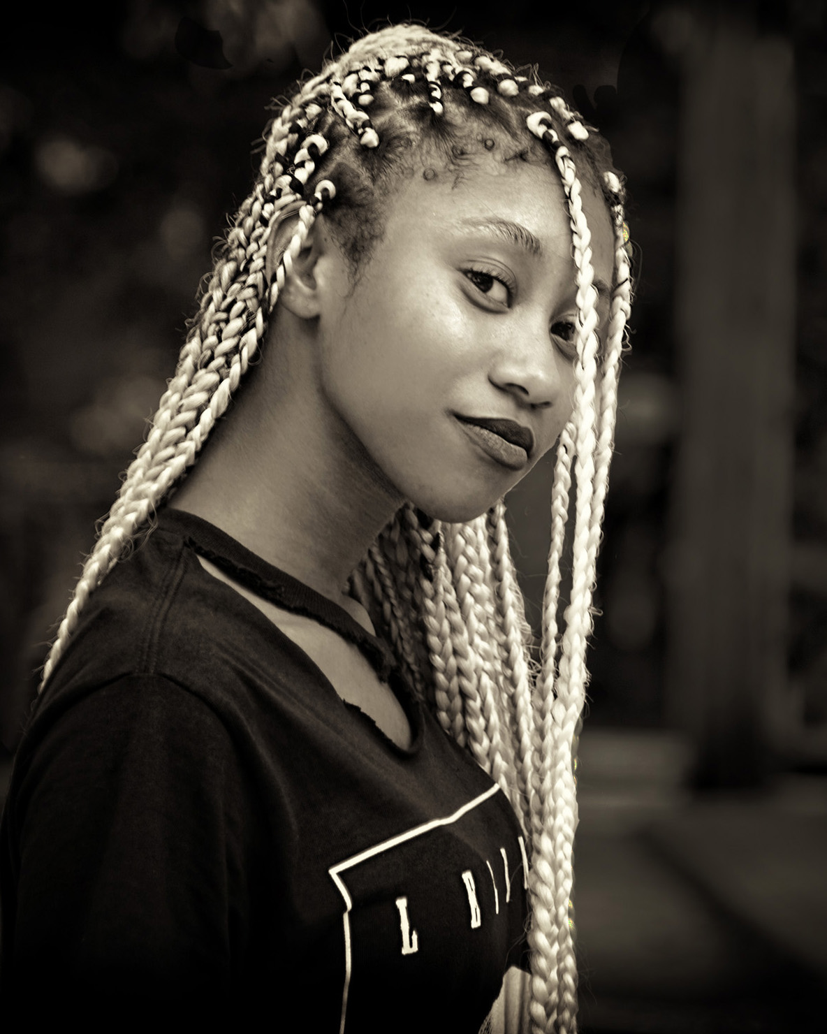
The next images are two of my environmental portraits from my home city, Baltimore. which I hope further show the significance between the color choice.

I encountered the young woman on the left while walking the streets of Fells Point, Baltimore. She was beyond friendly, and I knew right away that this simply had to be a color photo. Her own personal use of color pays glowing tribute to her individuality and independence. Black and White would have completely ruined this interpretation.
The girl on the right I met at a neighborhood festival in West Baltimore. The image is all about the lightness of her hair. The use of Black and White enabled her hair to be the focus of the composition without any distractions from the colors surrounding her. Color would have only greatly confused the viewer.
The section below consists of several pairs of related images where each set hopefully depicts the distinctions between choosing a Color or B&W presentation.
Young Athletes


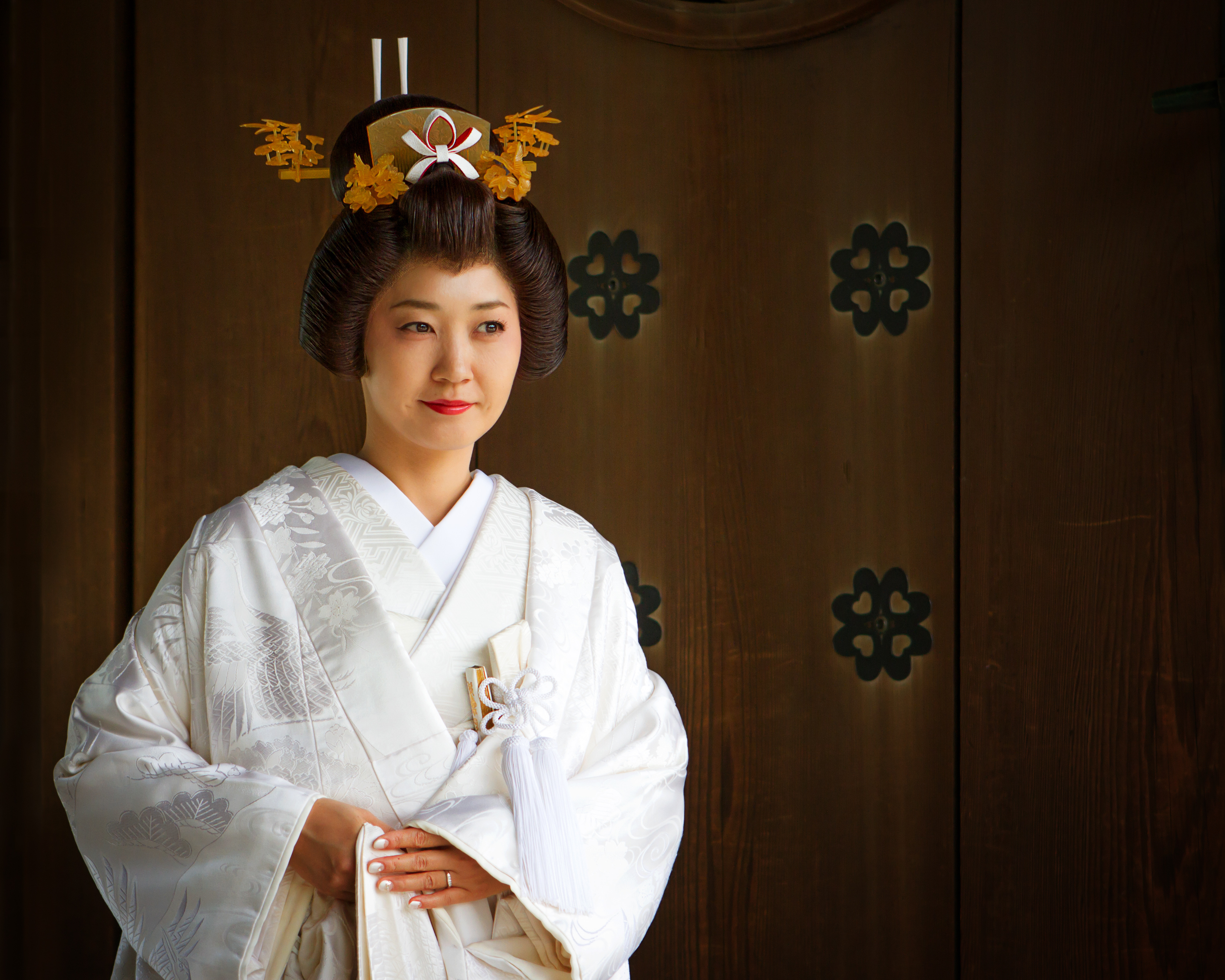
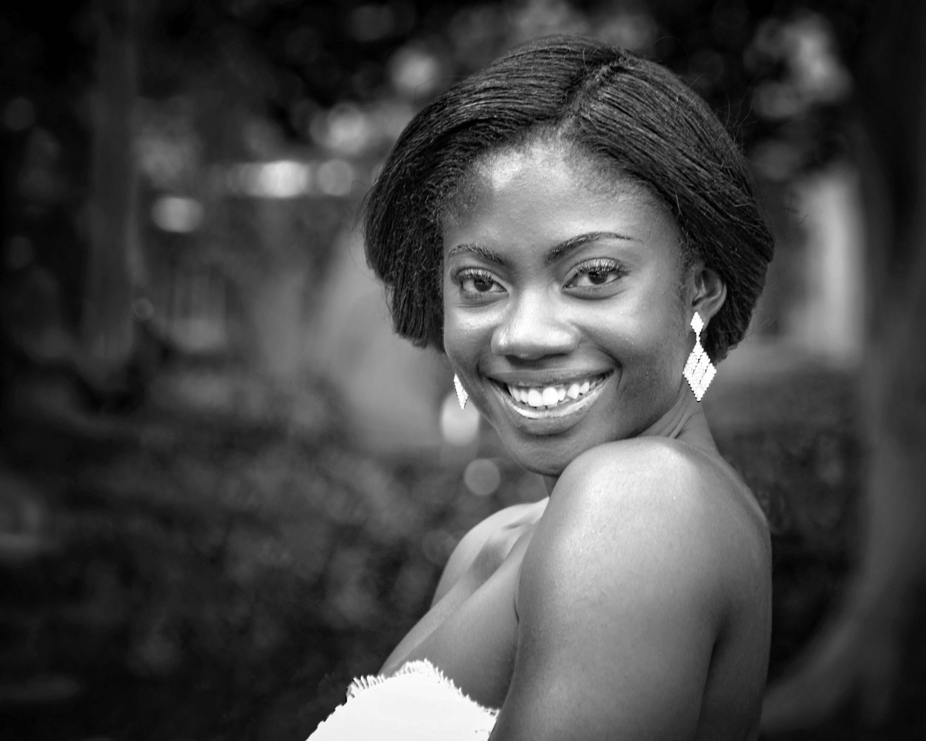
New Brides
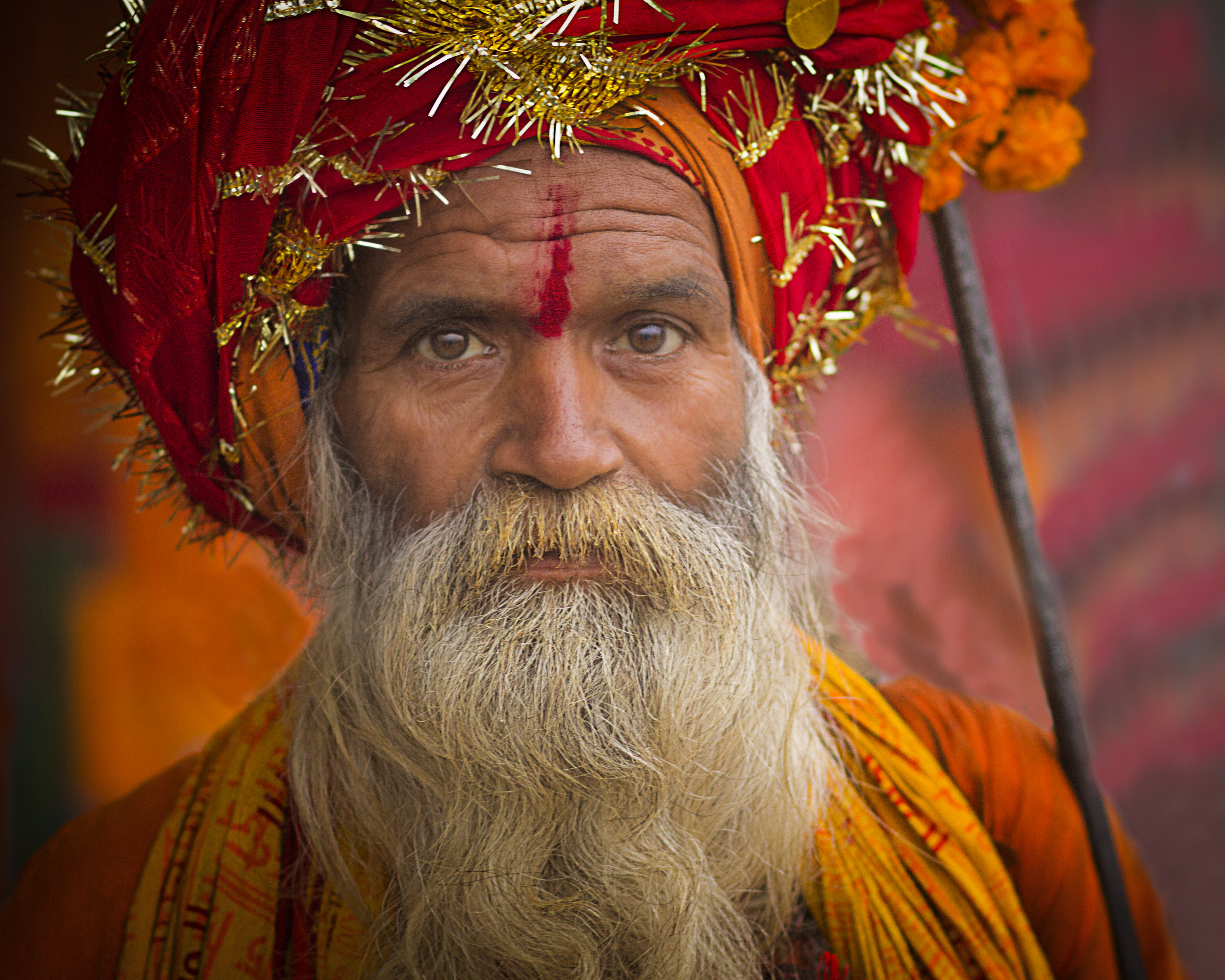
Men of India

Fun-Loving Girls

Baltimore’s Harbor


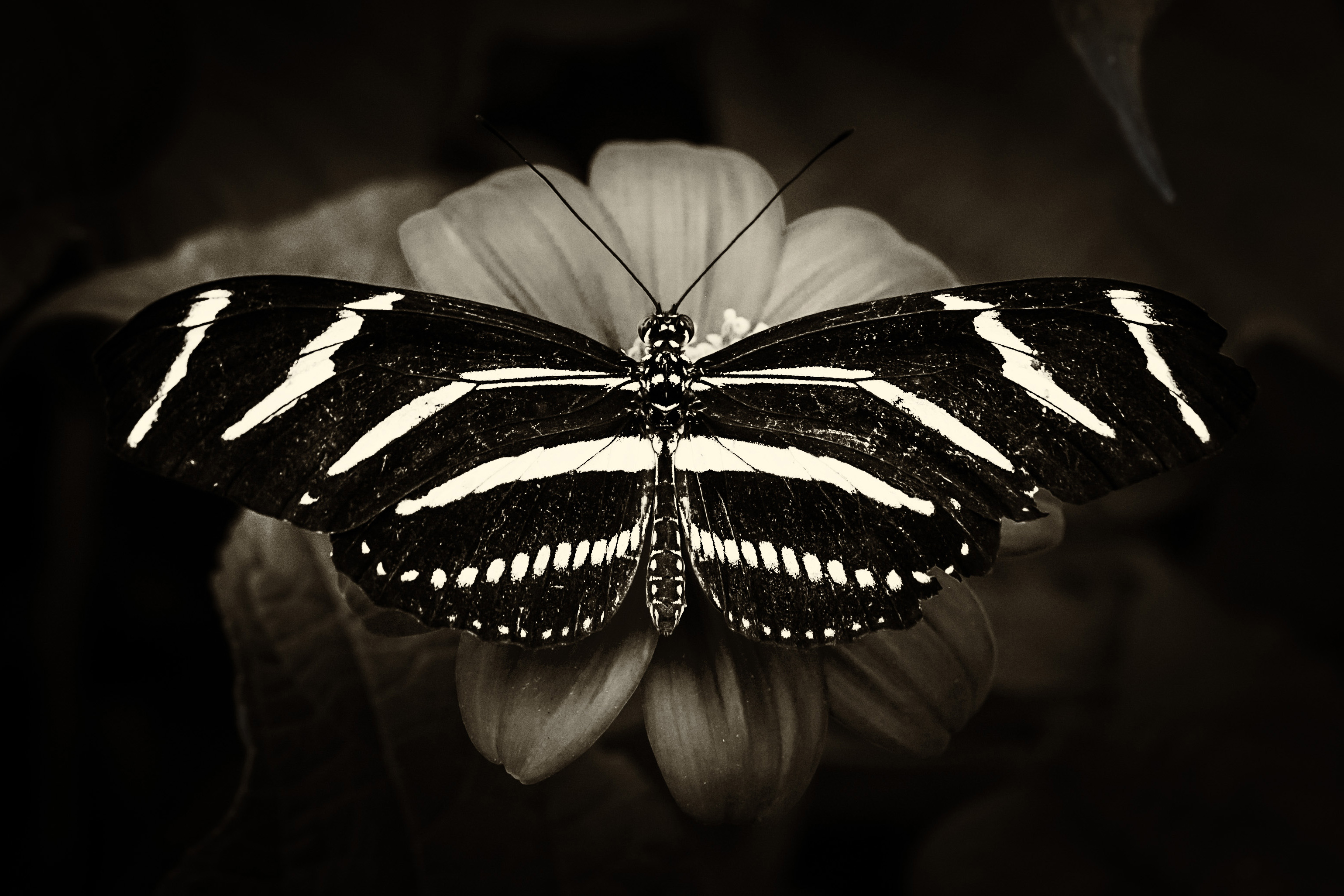
Beautiful Wings

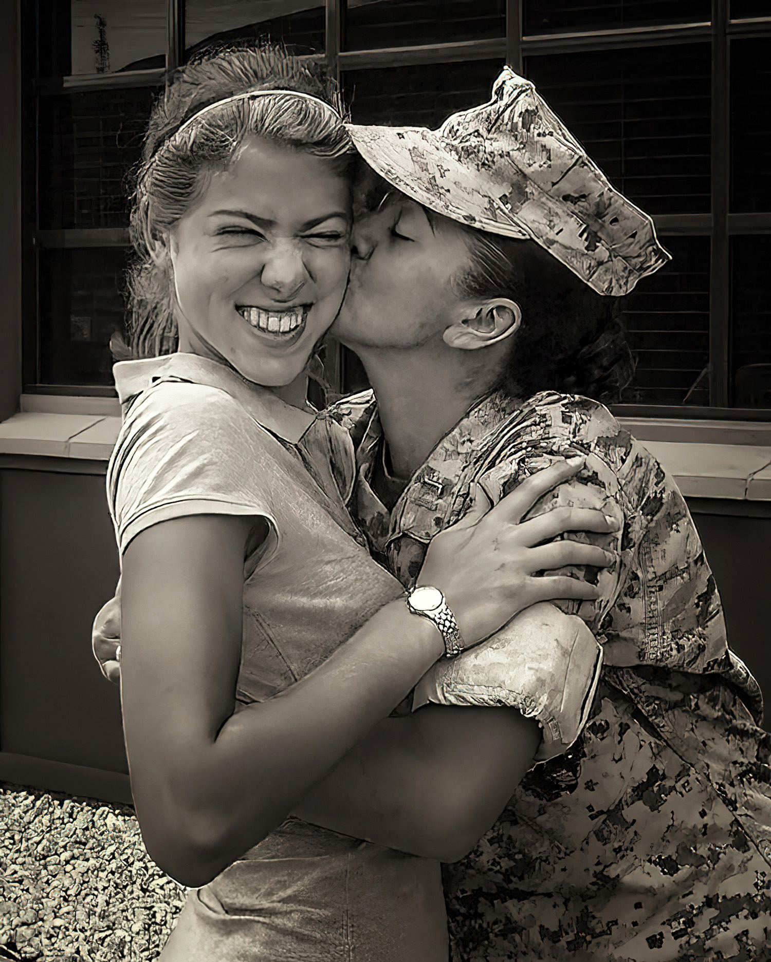
A Mother’s Love

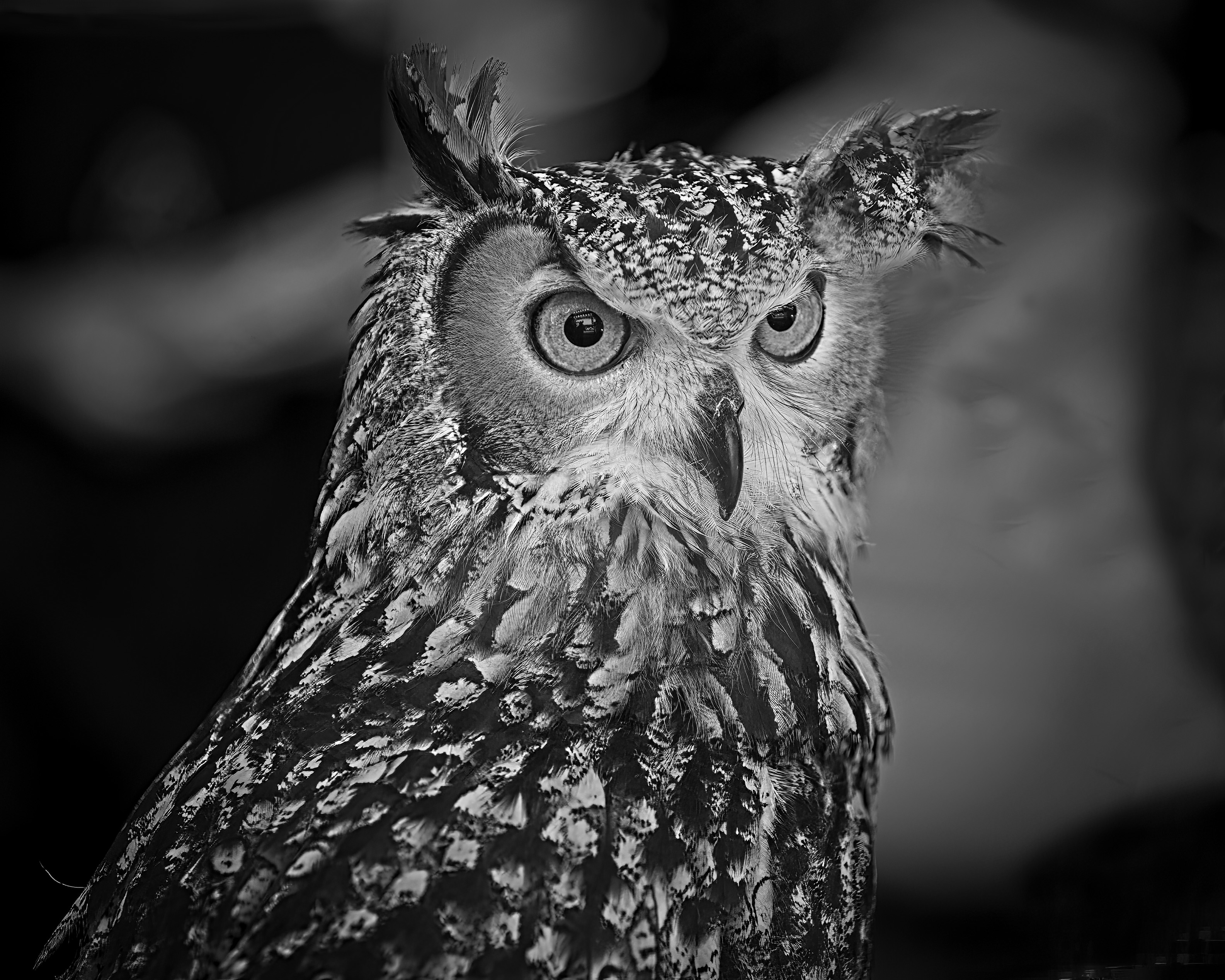
Birds of a Feather

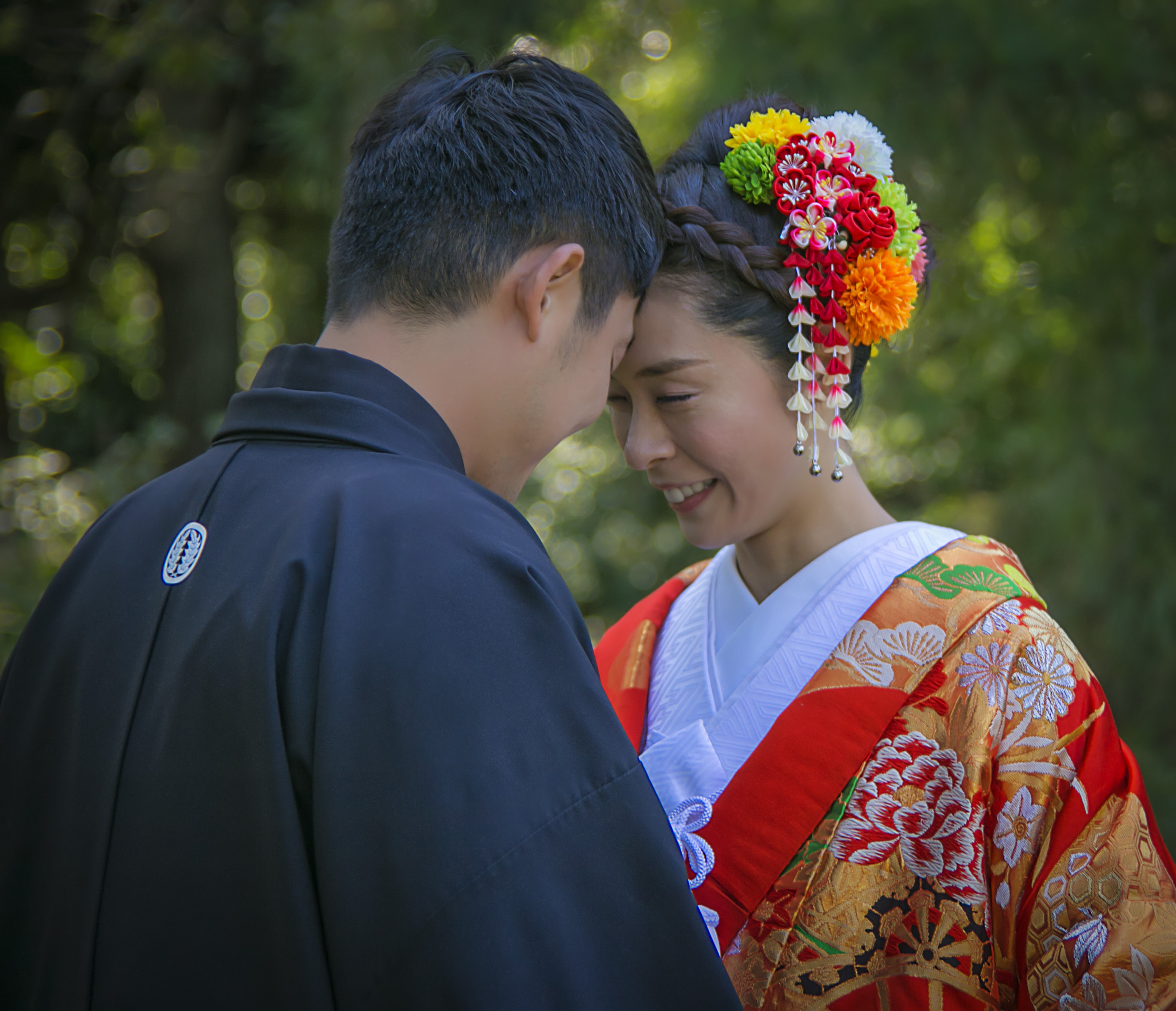
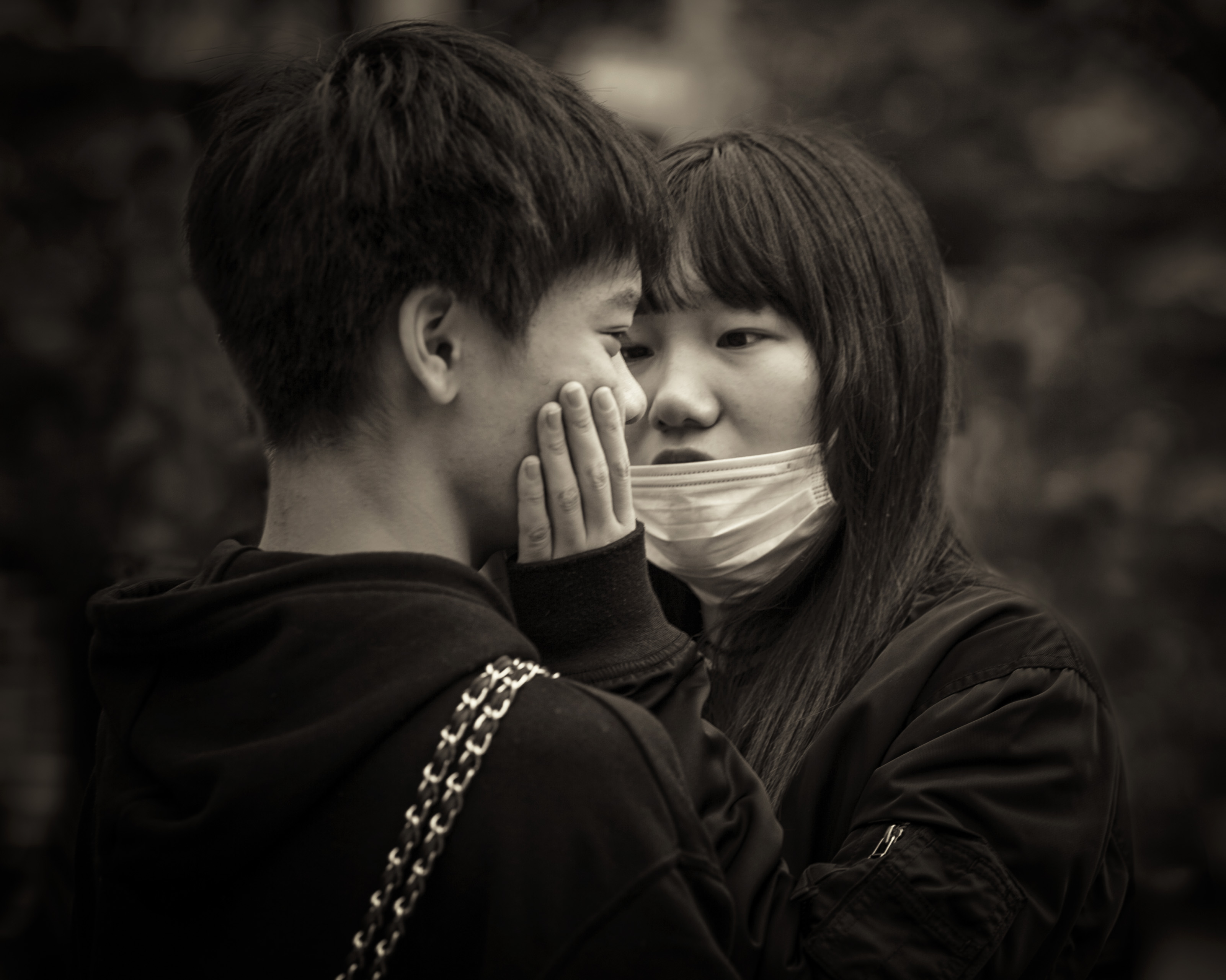
Young Lovers
The Look

Peaceful Waters


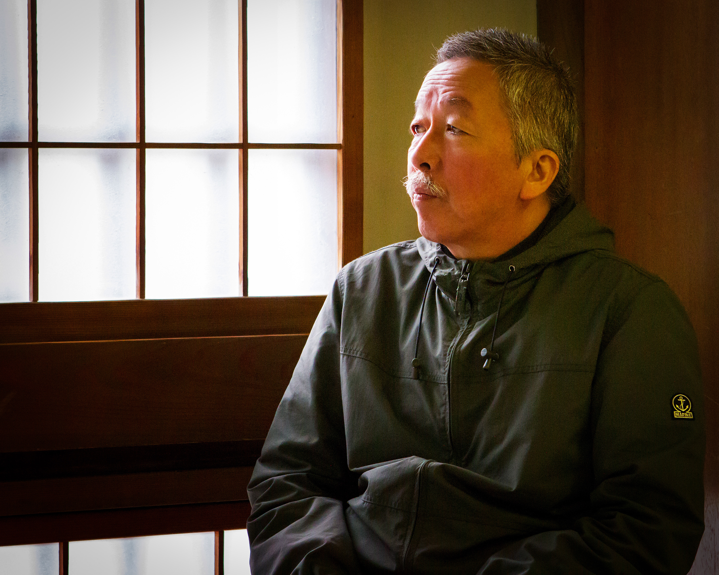
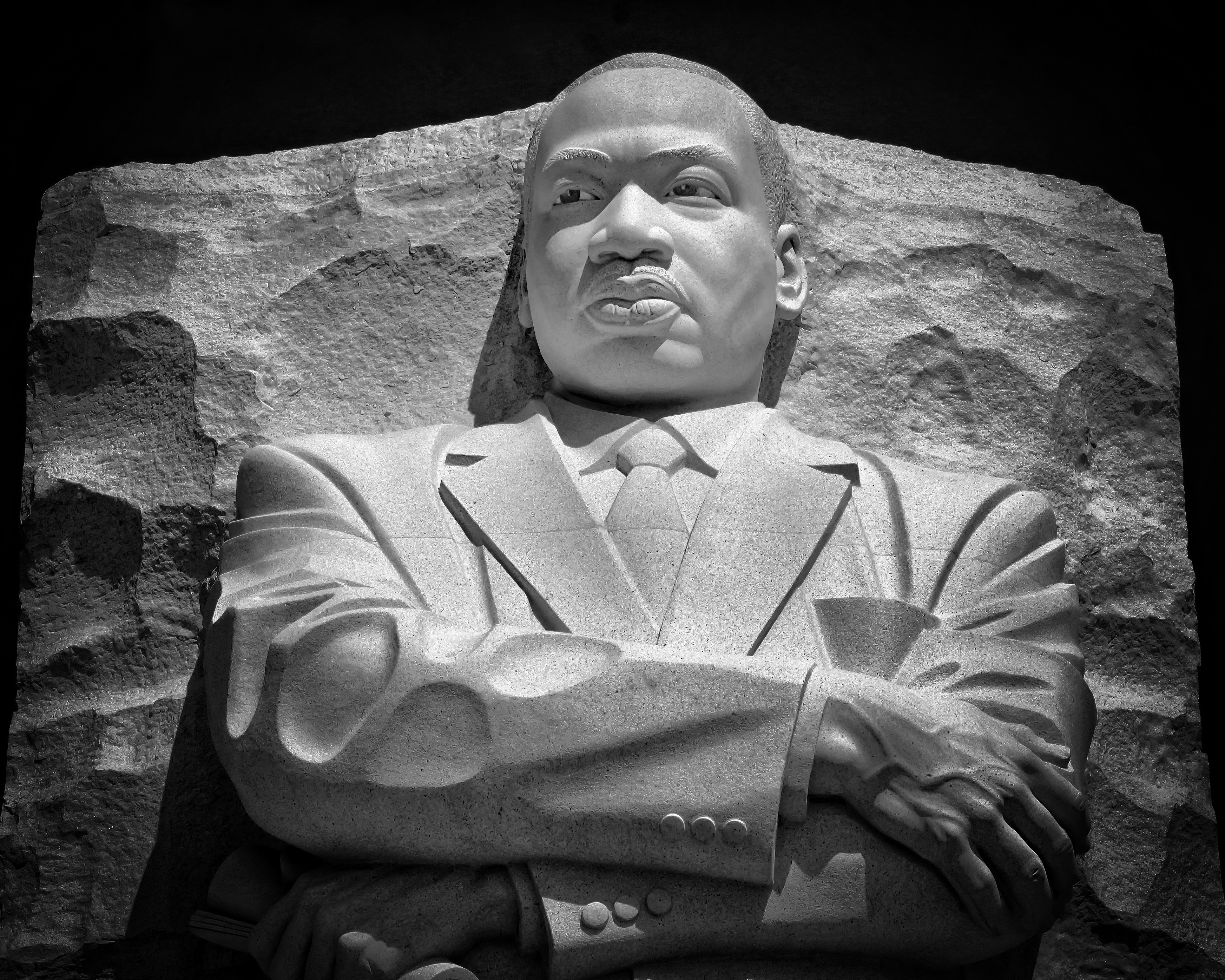
Thoughtful Men

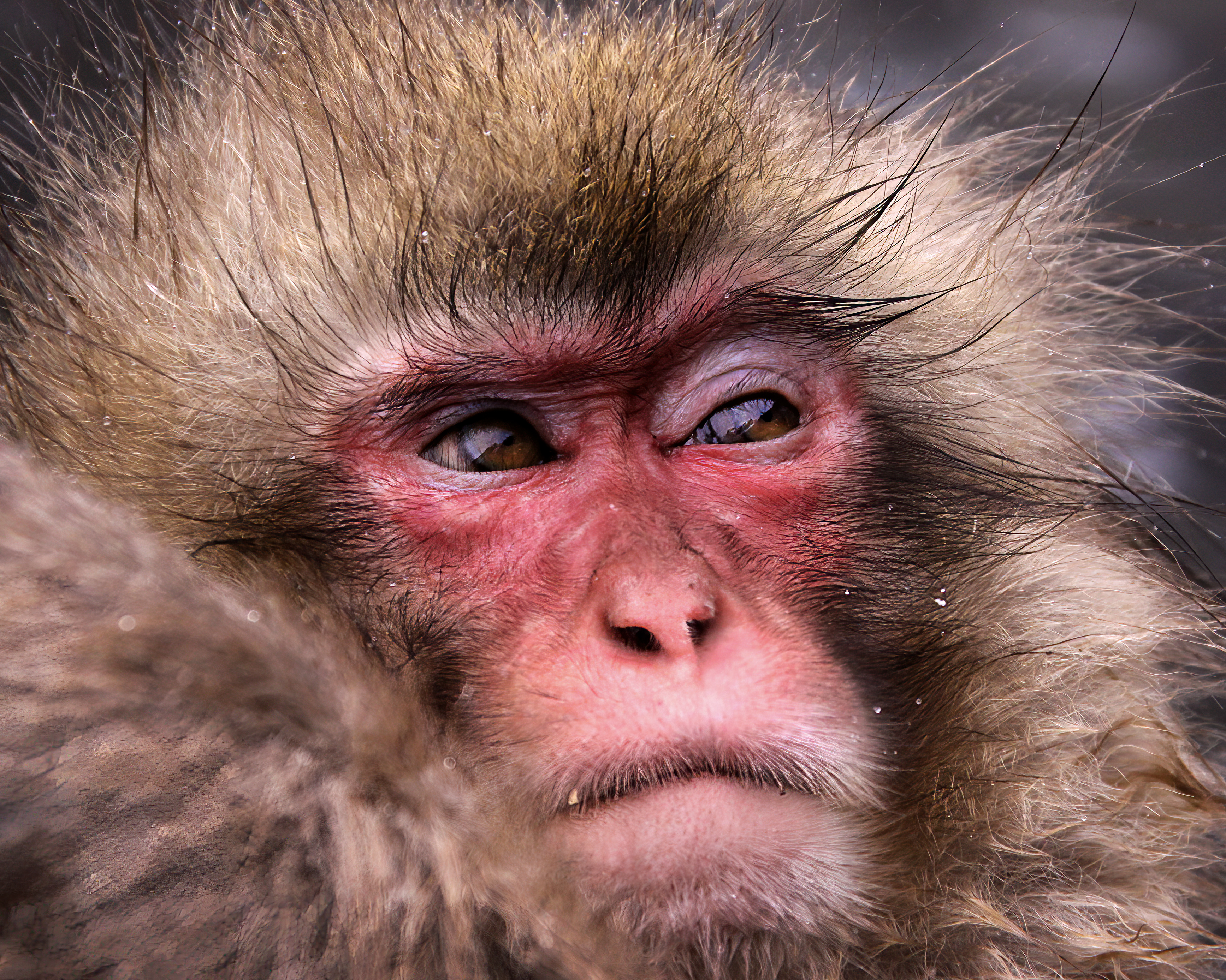
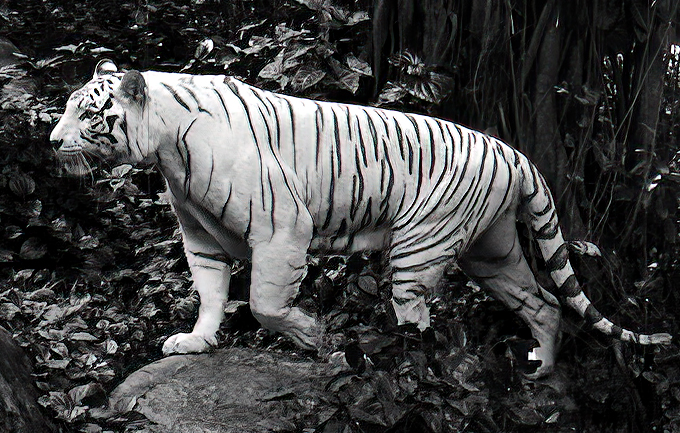
World of Mammals
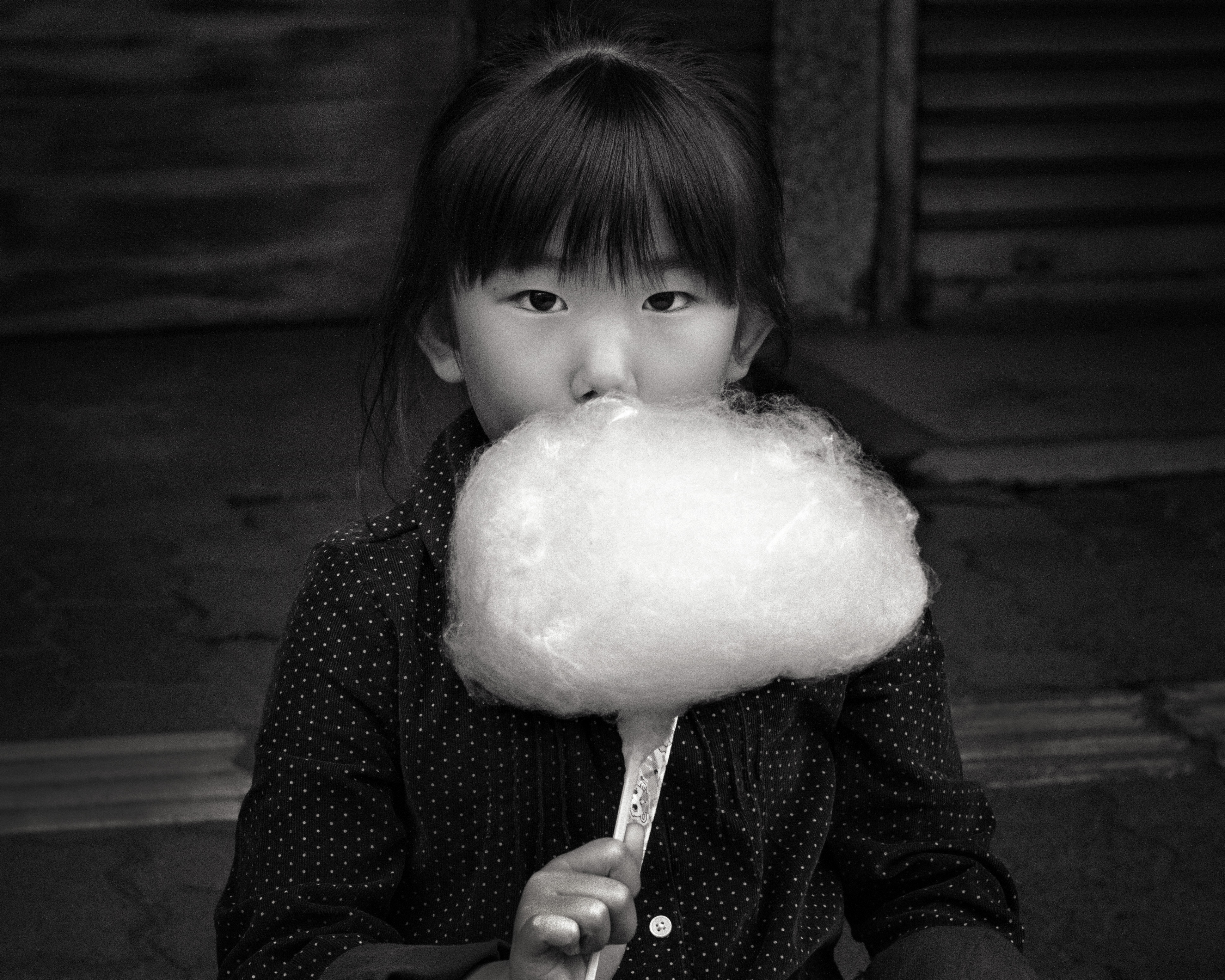
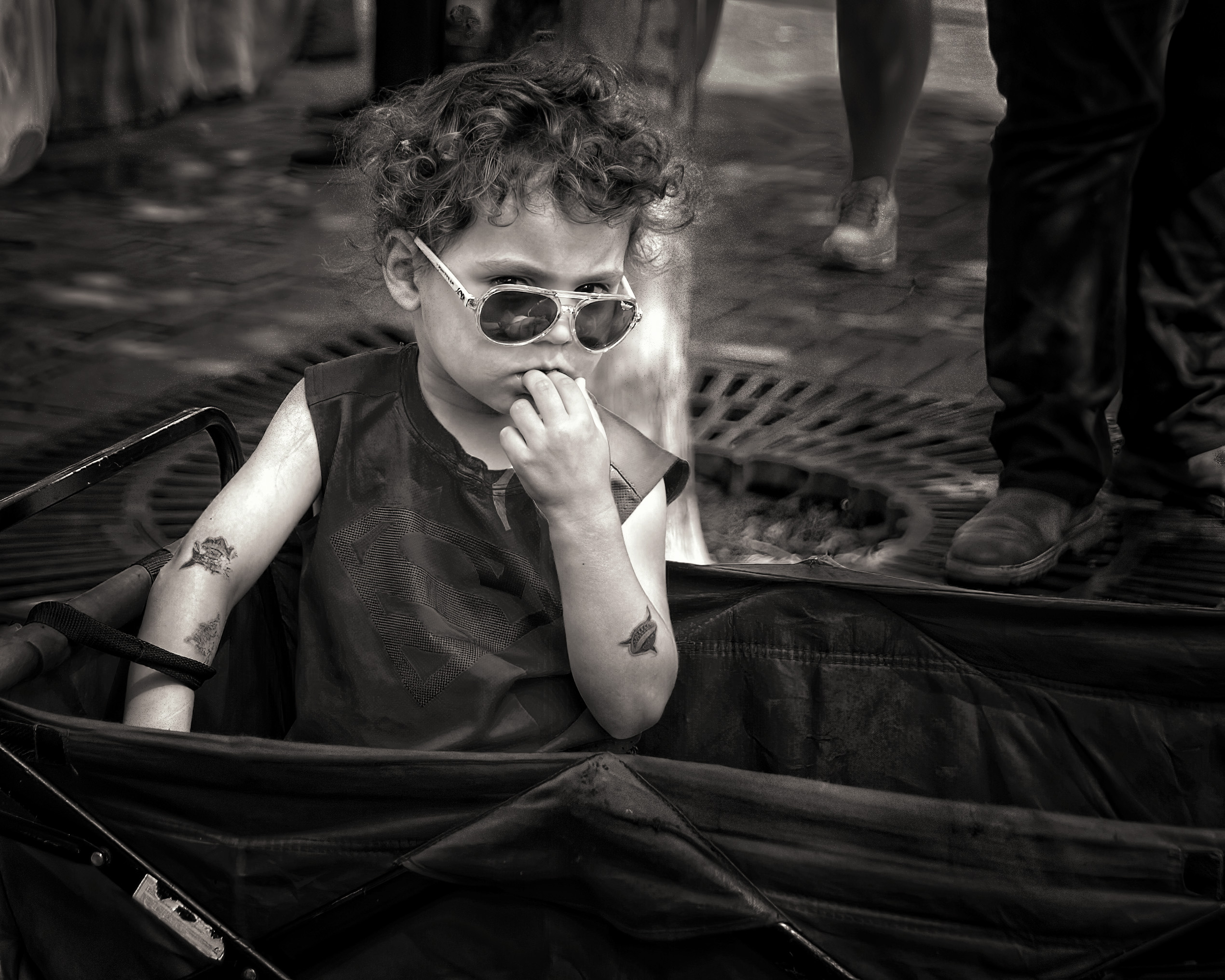
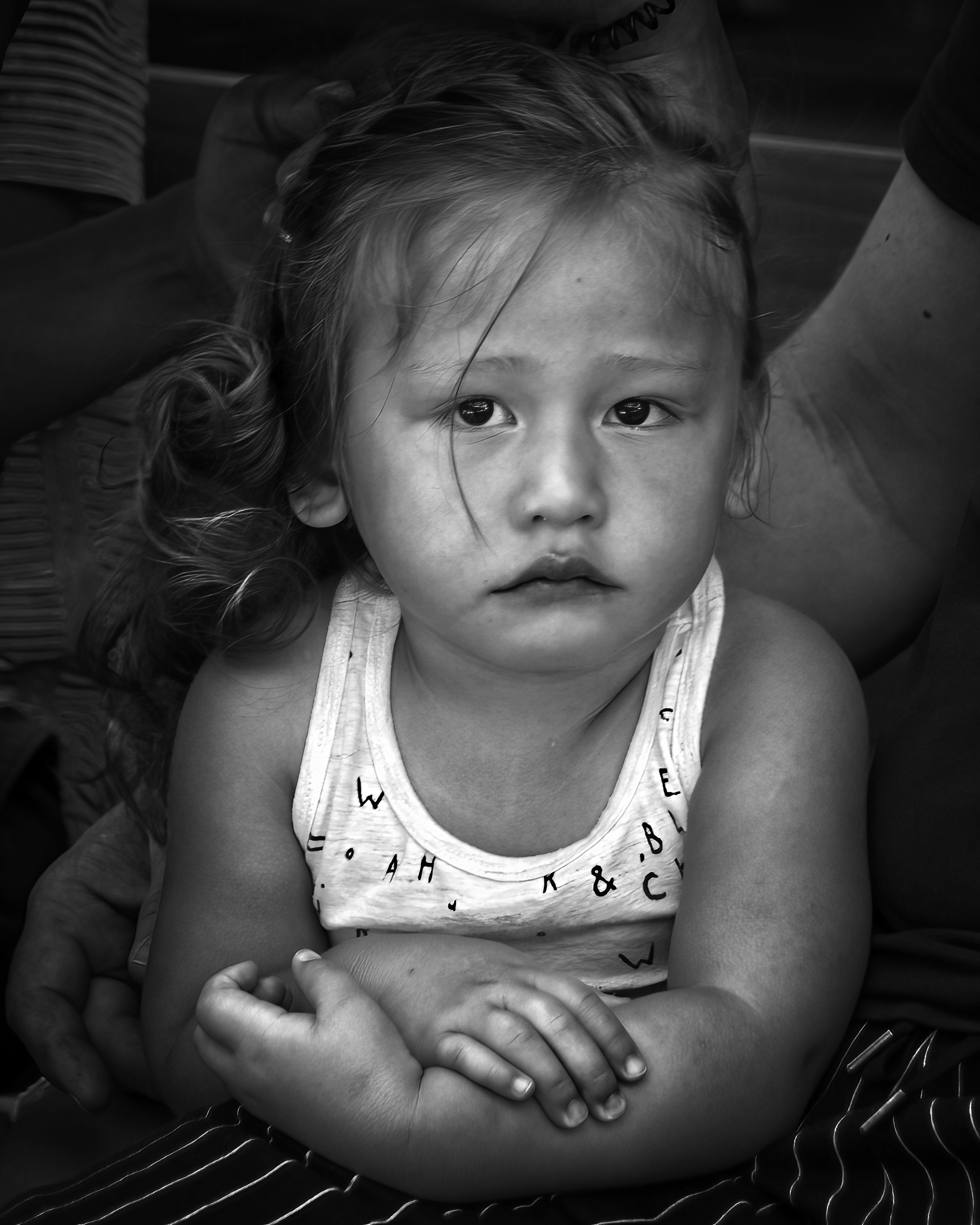
Thoughtful Little Girls
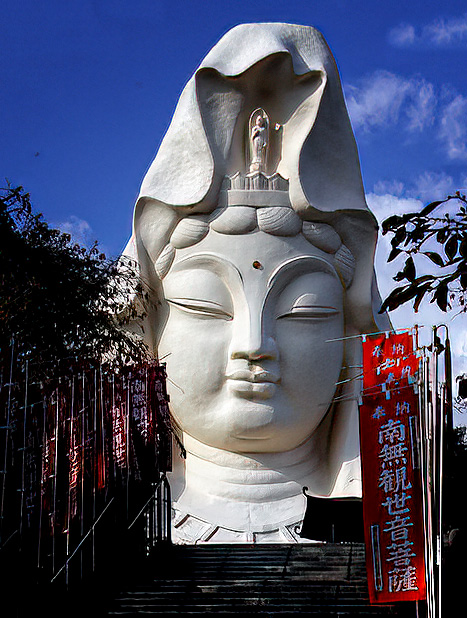
Cultural Icons
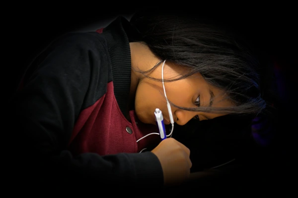
Hard-Working Students

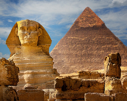
The Pyramid of Khafre

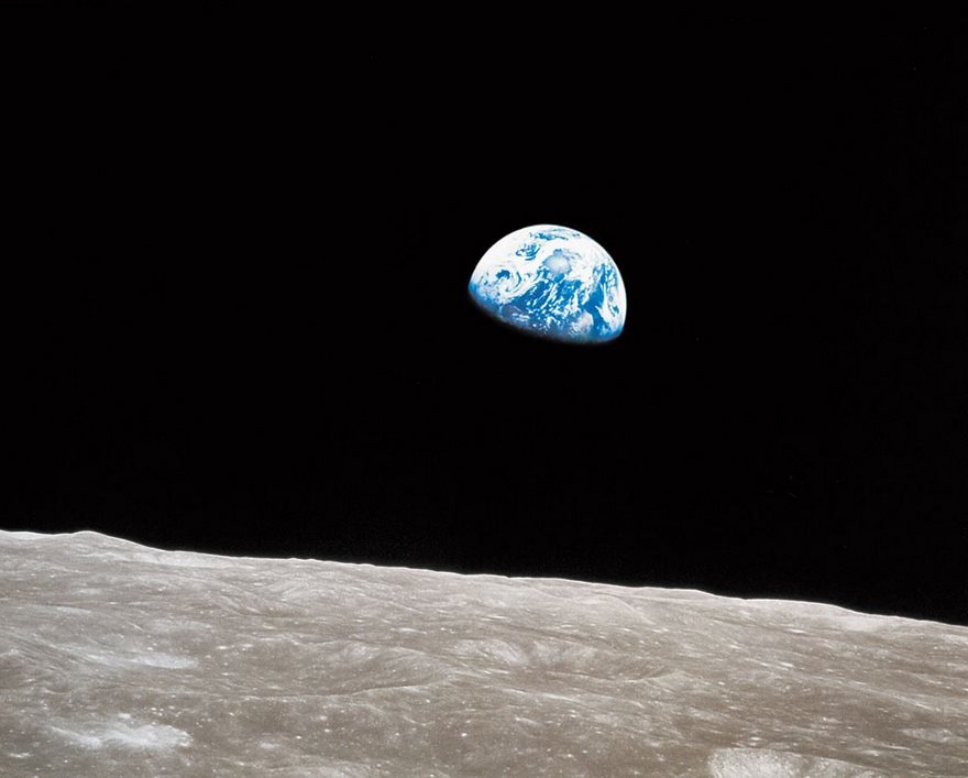
Finally, below are two images that use color or its absence to show the beauty of our world by two historic photographers. On the left is “Moonrise” by William Anders during the Apollo 8 mission in 1969. On the right is “Moonrise” by the master, Ansel Adams, in 1941. The choice between Color and B&W dictates the variance in mood or feelings evoked by the two images.